本文将对CSS3的特效属性进行解析并编写案例及编程。
 爱校码
爱校码
致力于少儿编程与软件工程的信息分享
一、CSS3边框
通过 CSS3,您能够创建圆角边框,向矩形添加阴影,使用图片来绘制边框。其有以下边框属性:
      属性                     描述
   border-radius      设置所有四个border-*-radius  属性的简写属性。
   box-shadow         向方框添加一个或多个阴影。
   border-image       设置所有border-image-*  属性的简写属性。
1.border-radius 属性
border-radius属性是一个简写属性,用于设置四个 border-*-radius属性。按顺时针顺序(上左->上右->下右->下左)设置。即:
border-top-left-radius
border-top-right-radius
border-bottom-right-radius
border-bottom-left-radius
语法:
border-radius: 1-4length|% / 1-4 length|%;
/* length:定义圆角的形状。% :以百分比定义圆角的形状。 */
斜杠/左边是四个圆角的水平半径,右边是四个圆角的垂直半径,按此顺时针顺序(上左->上右->下右->下左)设置属性值,如果省略 bottom-left,则与 top-right相同。如果省略bottom-right,则与top-left相同。如果省略top-right,则与 top-left相同。
例1:
border-radius:2em;
上例省略 了bottom-left、bottom-right、top-right值,则此三个属性值与top-left值相同。即:
border-top-left-radius:2em;
border-top-right-radius:2em;
border-bottom-right-radius:2em;
border-bottom-left-radius:2em;
例2:
border-radius:2em 1em 4em / 0.5em 3em;
上例省略了斜杠/左边bottom-left值,省略了斜杠/右边bottom-right和bottom-left值,则bottom-left值与 top-right值相同,斜杠/右边bottom-right值与斜杠/右边top-left值相同。即:
 border-top-left-radius:2em 0.5em;
 border-top-right-radius: 1em 3em;
 border-bottom-right-radius: 4em 0.5em;
 border-bottom-left-radius: 1em 3em;
清单 1:
<!DOCTYPE html>
<html>
<head>
    <meta charset="utf-8">
    <title>border-radius属性的使用</title>
    <style>
        div{
            text-align: center;
            border: 2px solid #a1a1a1;
            padding: 10px 40px;
            background: #dddddd;
            width: 350px;
            border-radius: 25px;
        }
    </style>
</head>
<body>
    <div>我是老百姓,向我添加圆角</div>
</body>
</html>
2.box-shadow 属性
box-shadow 属性向框添加一个或多个阴影。该属性是由逗号分隔的阴影列表,每个阴影由 2-4 个长度值、可选的颜色值以及可选的inset关键词来规定。
  值              描述
  h-shadow    必需。水平阴影的位置。允许负值。
  v-shadow    必需。垂直阴影的位置。允许负值。
  blur        可选。模糊距离。
  spread      可选。阴影的尺寸。
  color       可选。阴影的颜色。参阅  CSS  颜色值。
  inset       可选。将外部阴影  (outset)  改为内部阴影。
清单 2:
<!DOCTYPE html>
<html>
<head>
    <meta charset="utf-8">
    <title>box-shadow 属性的使用</title>
    <style>
        div{
            width: 300px;
            height: 100px;
            padding: 10px;
            text-align: center;
            background-color: #FF9900;
            box-shadow: 10px 10px 5px #888888;
        }
    </style>
</head>
<body>
    <div>今天很热,加点阴影</div>
</body>
</html>
3.border-image 属性
使用 border-image-*属性来构造漂亮的可伸缩按钮。border-image 属性是一个简写属性,用于设置以下属性:
border-image-source
border-image-slice
border-image-width
border-image-outset
border-image-repeat
解释如下:
   值                                 描述
border-image-source     用在边框的图片的路径
border-image-slice      图片边框向内偏移
border-image-width      图片边框的宽度
border-image-outset     边框图像区域超出边框的量
border-image-repeat     图像边框是否应平铺(repeated)、铺满(rounded)或拉伸(stretched)
border-image-source     用在边框的图片的路径
清单 3:
<!DOCTYPE html>
<html>
<head>
    <meta charset="utf-8">
    <title>border-image属性的使用</title>
    <style>
        div{
            border:10px solid transparent;
            width: 40px;
            padding: 5px 10px;
            border-image: url(img/btn.png) 0 14 0 14 stretch;
        }
    </style>
</head>
<body>
    <div>搜索</div>
    <p>使用的图片</p>
    <img src="img/btn.png" />
</body>
</html>
二、CSS3背景
2.1 background-color属性
background-color 属性设置元素的背景颜色。为标记元素设置一种纯色。这种颜色会填充元素的内容、内边距和边框区域,扩展到元素边框的外边界(但不包括外边距)。如果边框有透明部分(如虚线边框),会透过这些透明部分显示出背景色。
表示颜色的可能取值:
 值                  描述
color_name    规定颜色值为颜色名的背景色(如 red);
hex_number    规定颜色值为十六进制值的背景色(如 #FF0000);
rgb_number    规定颜色值为rgb代码的背景色(如rgb(255,0,0));
transparent   默认。背景颜色为透明;
清单 4:
<!DOCTYPE html>
<html>
<head>
    <meta charset="utf-8">
    <title>background-color属性的使用</title>
    <style>
        body{
            background-color: yellow;
        }
        h1{
            background-color: #00FF00;
        }
        h2{
            background-color: transparent;
        }
        p{
            background-color: rgb(255,0,255);
        }
        p.no2{
            background-color: gray;
        }
    </style>
</head>
<body>
    <h1>水是生命之源</h1>
    <h2>没有水,人类只能生存三天</h2>
    <h3>即每天喝杯水(约 2L)有利于身体健康</h3>
    <p>一名 20 多岁的男性,每日平均饮水量为 1.5-1.8 升。</p>
    <p class="no2">一位 20 多岁的女性,每日的饮水量可能为 1.3-1.4 升。</p>
</body>
</html>
尽管在大多数情况下,没有必要使用 transparent。不过如果不希望某元素拥有背景色,同时又不希望用户对浏览器的颜色设置影响到设计,那么设置 transparent 值还是有必要的。但有时在页面设计中,不需要纯透明,而是选择透明一部分,或者是有一个稍微的透明度,则用到后面的知识。
CSS3 颜色值透明表示方式(RGBA):
rgba(R,G,B,A)
取值:
R:红色值。正整数 | 百分数
G:绿色值。正整数 | 百分数
B:蓝色值。正整数 | 百分数
A:Alpha透明度。取值0~1之间。
如果一个元素的alpha通道数值为0%(或0),那该元素就是完全透明的,数值为100%(或255)时则意味着该元素完全不透明。
清单 5:
<!DOCTYPE html>
<html>
<head>
    <meta charset="utf-8">
    <title>background-color属性的rgba属性值的使用</title>
    <style>
        body{
            background-color: yellow;
        }
        h1{
            background-color: #00FF00;
        }
        h2{
            background-color: transparent;
        }
        h3{
            background-color: rgba(255,0,0,0.2);
        }
        p{
            background-color: rgb(255,0,255);
        }
        p.no2{
            background-color: gray;
        }
    </style>
</head>
<body>
    <h1>水是生命之源</h1>
    <h2>没有水,人类只能生存三天</h2>
    <h3>即每天喝杯水(约 2L)有利于身体健康</h3>
    <p>一名 20 多岁的男性,每日平均饮水量为 1.5-1.8 升。</p>
    <p class="no2">一位 20 多岁的女性,每日的饮水量可能为 1.3-1.4 升。</p>
</body>
</html>
CSS3 opacity透明度属性:
opacity:value|inherit;
opacity 属性设置元素的不透明级别。其值说明如下:
  值                          说明
value          规定不透明度,从 0.0 (完全透明)到 1.0(完全不透明)。
inherit         应该从父标记元素继承opacity 属性的值。
清单 6:
<!DOCTYPE html>
<html>
<head>
    <meta charset="utf-8">
    <title>opacity属性的使用</title>
    <style>
        div{
            width: 200px;
            height: 100px;
            margin: 0 auto;
            border: 1px solid black;
        }
        .div_rgba{
            background-color: rgba(255,0,0,0.5);
        }
        .div_opacity{
            background: red;
            opacity: 0.5;
        }
    </style>
</head>
<body>
    <div class="div_rgba">汽车市场的三大模式</div>
    <div class="div_opacity">零部件供应商模式、智选模式、HI 模式</div>
</body>
</html>
rgba与opacity区别:
opacity会继承父元素的 opacity 属性,而RGBA设置的元素的后代元素不会继承不透明属性。
2.2 background-image 属性与background-repeat属性
background-image 属性为标记元素设置背景图像。元素的背景占据了元素的全部尺寸,包括内边距和边框,但不包括外边距。默认地,背景图像位于元素的左上角,并在水平和垂直方向上重复。
background-image 属性的默认值是 none,表示背景上没有放置任何图像。如果需要设置一个背景图像,必须为这个属性设置一个URL 值:
background-image: url(图片文件);
background-repeat属性设置是否及如何重复背景图像。其可能的属性值:
  属性值               描述
  repeat              默认。背景图片将在垂直和水平方向重复;
  repeat-x            背景图片将在水平方向重复;
  repeat-y            背景图片将在垂直方向重复;
  no-repeat           背景图片将仅显示一次;
  inherit             从父标记元素继承background-repeat属性的设置;
清单 7:
<!DOCTYPE html>
<html>
<head>
    <meta charset="utf-8">
    <title>background-image与background-repeat属性</title>
    <style>
        body {
            background-image: url(img/bg.png);
            background-repeat: repeat;
        }
    </style>
</head>
<body>
</body>
</html>
2.3 background-attachment属性
background-attachment属性设置背景图像是否固定或者随页面其余部分而滚动。注意:需要结合background-repeat: no-repeat使用。
其可能的值如下:
    值                 描述
  scroll          默认值。背景图像随着页面其余部分的滚动而移动;
  fixed           当页面的其余部分滚动时,背景图像不会移动;
  inherit         从父标记元素继承background-attachment属性的设置;
清单 8:
<!DOCTYPE html>
<html>
<head>
    <meta charset="utf-8">
    <title>background-image与background-repeat属性</title>
    <style>
        body {
            background-image: url(img/bg.png);
            background-repeat: no-repeat;
            background-attachment: fixed;
        }
    </style>
</head>
<body>
    <p>a</p>
    <p>b</p>
    <p>c</p>
    <p>d</p>
    <p>e</p>
    <p>f</p>
    <p>g</p>
    <p>h</p>
    <p>i</p>
    <p>j</p>
    <p>k</p>
    <p>l</p>
    <p>m</p>
    <p>n</p>
    <p>o</p>
    <p>p</p>
    <p>q</p>
</body>
</html>
2.4 background-size属性
background-size 属性规定背景图像的尺寸。其可能的值如下:
    值                          表述
   w  h                   设置背景图像的宽度和高度;
   w%  h%                 以父标记元素的百分比设置背景图像的宽度和高度;
   cover                  将背景图像扩展至足够大,以完全覆盖背景区域;
   contain                将图像扩展至最大尺寸,使其宽度和高度完全适应内容区域;
清单 9“
<!DOCTYPE html>
<html>
<head>
    <meta charset="utf-8">
    <title>background-size属性的使用</title>
    <style>
        .bg{
            position: relative;
            width: 500px;
            height: 300px;
            border: 2px solid black;
            background-color: #808080;
            background-image: url(img/wood.png);
            background-repeat: no-repeat;
            background-size:contain;
        }

    </style>
</head>
<body>
    <div class="bg"></div>
</body>
</html>
2.5 background-position属性与background-origin属性
1.background-position 属性
background-position 属性设置背景图像的起始位置。这个属性设置背景原图像(由 background-image 定义)的位置,背景图像如果要重复,将从这一点开始。
background-position: 属性值;
其可能的属性值如下:
      值                            描述
    top left               如果仅规定一个值,则第二个值是center。
    top center
    top right
    center left
    center center
    center right
    bottom left
    bottom center
    bottom right

    x% y%                 第一个值是水平位置,第二个值是垂直位置;
                          左上角是0% 0%,右下角是100% 100% ;
                          如果仅规定一个值,则另一个值将是50%。
   xpos ypos              第一个值是水平位置,第二个值是垂直位置;
                          左上角是0px 0px,如果仅规定一个值,则另一个值将是其50%;
                          可以混合使用%和position值。
2.background-origin 属性
background-origin属性规定 background-position 属性相对于什么位置来定位。
background-origin: padding-box | border-box | content-box;
注意:如果背景图像的 background-attachment 属性为 "fixed",则该属性没有效果。
清单 10:
<!DOCTYPE html>
<html>
<head>
    <meta charset="utf-8">
    <title>background-position属性与background-origin属性的使用</title>
    <style>
        .bg{
            position: relative;
            width: 500px;
            height: 300px;
            margin: 20px;
            border: 10px solid black;
            padding: 20px;
            background-color: #808080;
            background-image: url(img/wood.png);
            background-repeat: no-repeat;
            background-size:300px;
            background-position: 5px 5px;
            background-origin: content-box;
        }

    </style>
</head>
<body>
    <div class="bg">世界上第一根光纤,是谁造出来的?比尔·阿姆斯特德(Bill Armistead)</div>
</body>
</html>
三、CSS3文本效果
3.1 text-shadow属性
使用text-shoadow设置文本阴影效果。规定水平阴影、垂直阴影、模糊距离,以及阴影的颜色。
text-shadow: 5px 5px 5px #FF0000; /* 依次为:水平阴影、垂直阴影、模糊距离、阴影的颜色 */
清单 11:
<!DOCTYPE html>
<html>
<head>
    <meta charset="utf-8">
    <title>text-shadow属性的使用</title>
    <style>
        h1{
            text-shadow: 5px 5px 5px #FF0000;
        }
    </style>
</head>
<body>
    <h1>爱校码.中国</h1>
</body>
</html>
3.2 word-wrap属性
word-wrap属性允许允许对文本进行强制自动换行,即使意味着对单词进行拆分。
word-wrap: normal|break-word;
其可能的属性值:
  值                  描述
normal            只在允许的断字点换行(浏览器保持默认处理)。
break-word        在长单词或 URL 地址内部进行换行。
清单 12:
<!DOCTYPE html>
<html>
<head>
    <meta charset="utf-8">
    <title>word-wrap属性的使用</title>
    <style>
        p.word{
            width:11em;
            border:1px solid #000000;
            word-wrap:break-word;
        }
    </style>
</head>
<body>
    <p class="word">爱校码:http://www.ischoolcode.cn</p>
</body>
</html>
四、CSS3 字体
4.1 @font-face 规则
CSS 的之前版本,将不得不使用当前计算机上已经安装的字体,使用将受到一定范围的限制。现CSS3可以使用任何喜欢的字体。
要使用的字体文件,只需将其包含在网站中,它会自动下载给需要的用户。所选择的字体在 CSS3的@font-face 规则中描述。在新的 @font-face 规则中,必须首先定义字体的名称(如 MyFont),然后指向该字体文件。
@font-face{
      font-family: 'MyFont';
      src: url('字体文件');
}
为HTML 标记元素使用字体,通过 font-family 属性来引用已定义字体的名称 MyFont:
/* div为HTML页面中的一个标记 */
div{
    font-family:'MyFont';
}
4.2 CSS3 字体描述
以下列出了@font-face规则定义的字体描述明细:
    属性              值                   描述
   font-family       name              必需。规定字体的名称。
   src               URL               必需。定义字体文件的 URL。
   font-stretch      normal            可选。定义如何拉伸字体。默认是 "normal"。
                     condensed
                     ultra-condensed
                     extra-condensed
                     semi-condensed
                     expanded
                     semi-expanded
                     extra-expanded
                     ultra-expanded
    font-style       normal            可选。定义字体的样式。默认是 "normal"。
                     italic
                     oblique
    font-weight      normal            可选。定义字体的粗细。默认是 "normal"。
                     bold
                     100
                     200
                     300
                     400
                     500
                     600
                     700
                     800
                     900
   unicode-range     unicode-range    可选。定义字体支持的 UNICODE 字符范围。默认是 "U+0-10FFFF"。
清单 13:
<!DOCTYPE html>
<html>
<head>
    <meta charset="utf-8">
    <title>css3字体的使用</title>
    <style>
        @font-face {
          font-family: 'Glyphicons Halflings';

          src: url('./fonts/glyphicons-halflings-regular.eot');
               /* 嵌入式开放类型 (Embedded Open Type,简称EOT),仅由IE支持 */
          src: url('./fonts/glyphicons-halflings-regular.eot?#iefix') format('embedded-opentype'),
                /* Web开放字体格式2.0,用于动态传输网页字体,基于Brotli压缩算法,提高Web浏览速度 */
               url('./fonts/glyphicons-halflings-regular.woff2') format('woff2'),
               /* Web开放字体格式(Web Open Font Format,简称WOFF)*/
               url('./fonts/glyphicons-halflings-regular.woff') format('woff'),
               /* TrueType字体(TrueType Font, 简称TTF)*/
               url('./fonts/glyphicons-halflings-regular.ttf') format('truetype'),
               /* 可伸缩矢量图形字体(Scalable Vector Graphics,简称SVG) */
               url('./fonts/glyphicons-halflings-regular.svg#glyphicons_halflingsregular') format('svg');
        }
        .glyphicon {
          position: relative;
          top: 1px;
          display: inline-block;
          font-family: 'Glyphicons Halflings';
          font-style: normal;
          font-weight: normal;
          line-height: 1;

          /* 对字体进行抗锯齿渲染 */
          /* Webkit引擎中支持, 它有none、subpixel-antialiased、antialiased三个属性值。 */
          -webkit-font-smoothing: antialiased;
          /* Gecko引擎中支持, 它有inherit、grayscale 两个属性值。 */
          -moz-osx-font-smoothing: grayscale;
        }

        /* :before 选择器向选定的元素前插入内容。*/
        .glyphicon-shopping-cart:before {
            /* Unicode引用,Unicode是字体在网页端最原始的应用方式。*/
            content: "\e116";
        }
        .glyphicon-music:before {
          content: "\e002";
        }
        .glyphicon-search:before {
          content: "\e003";
        }
        .glyphicon-star:before {
          content: "\e006";
        }
        .glyphicon-user:before {
          content: "\e008";
        }
        .glyphicon-ok:before {
          content: "\e013";
        }
    </style>

</head>
<body>
    <div>
        <i class="glyphicon glyphicon-shopping-cart"></i> 购物车
        <i class="glyphicon glyphicon-music"></i> 音乐
        <i class="glyphicon glyphicon-search"></i> 搜索
        <i class="glyphicon glyphicon-star"></i> 星星
        <i class="glyphicon glyphicon-user"></i> 用户
        <i class="glyphicon glyphicon-ok"></i> OK
    </div>

</body>
</html>
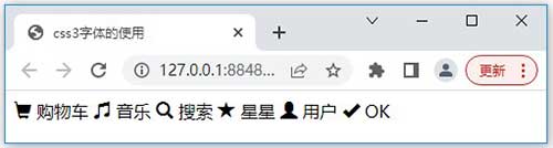
执行效果如下:
五、CSS3 2D转换
通过 CSS3 转换,我们能够对元素进行移动、缩放、转动、拉长或拉伸。
5.1 translate()方法
表示针对对象进行平移,按照设定的x,y参数值,当值为负数时,反方向移动物体,其基点默认为元素 中心点,也可以根据transform-origin进行改变基点。如transform:translate(100px,20px)。
清单 14:
<!DOCTYPE html>
<html>
<head>
    <meta charset="utf-8">
    <title>translate(x, y)方法</title>
    <style>
        div {
            width: 100px;
            height: 75px;
            background-color: red;
            border: 1px solid black;
        }
        div#move{
            transform:translate(50px,100px);
        }
    </style>
</head>
<body>
    <div>我在这里不动。</div>
    <div id="move">
        我动了。x方向移动50px, y方向移动100px。
    </div>
</body>
</html>
5.2 rotate()方法
通过 rotate()方法,标记元素顺时针旋转给定的角度。允许负值,元素将逆时针旋转。
清单 15:
<!DOCTYPE html>
<html>
<head>
    <meta charset="utf-8">
    <title>rotate()方法 </title>
    <style>
        div {
            width: 100px;
            height: 75px;
            background-color: yellow;
            border: 1px solid black;
        }

        div#rotate {
            transform: rotate(30deg);
        }
    </style>
</head>
<body>
    <div>你好。请在这里不要动。</div>
    <div id="rotate">我转一个。</div>
</body>
</html>
5.3 scale()方法
通过 scale() 方法,根据给定的宽度(X 轴)和高度(Y 轴)参数,标记元素的尺寸会增加或减少。
清单 16:
<!DOCTYPE html>
<html>
<head>
    <meta charset="utf-8">
    <title>scale()方法</title>
    <style>
        div {
            width: 100px;
            height: 75px;
            background-color: yellow;
            border: 1px solid black;
        }

        div#scale {
            margin: 100px;
            transform: scale(2, 4);
        }
    </style>
</head>
<body>
    <div>待好了,不要动。</div>
    <div id="scale">
        我舒展一下筋骨。
    </div>
</body>
</html>
5.4 skew()方法
通过 skew()方法,根据给定的水平线(X 轴)和垂直线(Y 轴)参数, 标记元素翻转给定的角度。
清单 17:
<!DOCTYPE html>
<html>
<head>
    <meta charset="utf-8">
    <title>skew() 方法</title>
    <style>
        div {
            width: 100px;
            height: 75px;
            background-color: palevioletred;
            border: 1px solid black;
        }

        div#skew {
            transform: skew(30deg, 20deg);
        }
    </style>
</head>
<body>
    <div>你这个猪八戒,待在原地不要动。</div>
    <div id="skew">我是孙悟空,翻一个筋斗。</div>
</body>
</html>
5.5 matrix()方法
matrix()方法把所有2D 转换方法组合在一起。它需要六个参数,包含标记元素的旋转,缩放,移动(平移)和倾斜功能。
清单 18:
<!DOCTYPE html>
<html>
<head>
    <meta charset="utf-8">
    <title>matrix()方法</title>
    <style>
        div{
            width:100px;
            height:75px;
            background-color:lightblue;
            border:1px solid black;
        }
        div#matrix{
            transform:matrix(0.866,0.5,-0.5,0.866,0,0);/* 参数对应:旋转,缩放,平移和倾斜。 */
        }
    </style>
</head>
<body>
    <div>猪八戒不动了。</div>
    <div id="matrix">孙悟空!稍微动一下。</div>
</body>
</html>
六、CSS3 3D转换
CSS3 允许使用 3D 转换来对标记元素进行格式化。
6.1 rotateX()方法
通过 rotateX()方法,标记元素围绕其 X 轴以给定的度数进行旋转。
清单 19:
<!DOCTYPE html>
<html>
<head>
    <meta charset="utf-8">
    <title>rotateX() 方法</title>
    <style>
        div{
            width:100px;
            height:75px;
            background-color:brown;
            border:1px solid black;
        }
        div#rotateX{
            transform:rotateX(120deg);
            -webkit-transform:rotateX(120deg); /* Safari and Chrome */
            -moz-transform:rotateX(120deg);    /* Firefox */
        }
    </style>
</head>
<body>
    <div>不动</div>
    <div id="rotateX">绕x轴转一下</div>
</body>
</html>
6.2 rotateY()方法
通过rotateY()方法,标记元素围绕其Y 轴以给定的度数进行旋转。
清单 20:
<!DOCTYPE html>
<html>
<head>
    <meta charset="utf-8">
    <title>rotateY()方法</title>
    <style>
        div{
            width:100px;
            height:75px;
            background-color:green;
            border:1px solid black;
            margin: 5px;
        }
        div#rotateY{
            transform:rotateY(60deg);
            -webkit-transform:rotateY(60deg); /* Safari and Chrome */
            -moz-transform:rotateY(60deg);    /* Firefox */
        }
    </style>
</head>
<body>
    <div>还是不动</div>
    <div id="rotateY">围绕Y轴转一下。</div>
</body>
</html>
七、CSS3 过渡
1. 过渡的功能
通过 CSS3过渡,我们可以在不使用 Flash 动画或JavaScript 的情况下,当元素从一种样式变换为另一种样式时为标记元素添加效果。
CSS3 过渡,是标记元素从一种样式逐渐改变为另一种的效果,要实现这一点,必须规定两项内容:
- (1)规定您希望把效果添加到哪个 CSS 属性上
- (2)规定效果的时长
应用于某css属性的过渡效果,时长为t秒定义如下:
transition: css属性 t;
清单 21:
<!DOCTYPE html>
<html>
<head>
    <meta charset="utf-8">
    <title>transition过渡</title>
    <style>
        div {
            width: 100px;
            height: 100px;
            background: burlywood;
            transition: width 2s;
            -moz-transition: width 2s;    /* Firefox 4 */
            -webkit-transition: width 2s; /* Safari and Chrome */
            -o-transition: width 2s;      /* Opera */
        }

        div:hover {
            width: 300px;
        }
    </style>
</head>
<body>
    <div>请将鼠标移过来悬停,感受一下。</div>
</body>
</html>
清单21运行中,将鼠标放到div上时,宽度属性的过渡效果,时长为 2 秒。
2. 多项标记元素的改变
如需向多个样式添加过渡效果,请添加多个属性,由逗号隔开。
清单 22:
<!DOCTYPE html>
<html>
<head>
    <meta charset="utf-8">
    <title>多项标记元素过渡效果</title>
    <style>
        div {
            width: 100px;
            height: 100px;
            background: yellow;
            transition: width 2s, height 2s;
            /* Firefox 4 */
            -moz-transition: width 2s, height 2s, -moz-transform 2s;
            /* Safari and Chrome */
            -webkit-transition: width 2s, height 2s, -webkit-transform 2s;
            /* Opera */
            -o-transition: width 2s, height 2s, -o-transform 2s;
        }

        div:hover {
            width: 200px;
            height: 200px;
            transform: rotate(180deg);
            /* Firefox 4 */
            -moz-transform: rotate(180deg);
            /* Safari and Chrome */
            -webkit-transform: rotate(180deg);
            /* Opera */
            -o-transform: rotate(180deg);
        }
    </style>
</head>
<body>
    <div>对面的鼠标移过来,放在我的上面,看一下过渡效果。</div>
</body>
</html>
3. 过渡属性
以下列出了所有的过渡属性:
  属性                         描述
transition                 简写属性,用于在一个属性中设置四个过渡属性;
transition-property        规定应用过渡的 CSS 属性的名称;
transition-duration        定义过渡效果花费的时间。默认是 0;
transition-timing-function 规定过渡效果的时间曲线。默认是 "ease";
transition-delay           规定过渡效果何时开始。默认是 0。
清单 23:
<!DOCTYPE html>
<html>
<head>
    <meta charset="utf-8">
    <title>所有过渡属性效果实现</title>
    <style>
        div {
            width: 100px;
            height: 100px;
            background: rosybrown;
            transition-property: width;
            transition-duration: 1s;
            transition-timing-function: linear;
            transition-delay: 2s;
            /* Firefox 4 */
            -moz-transition-property: width;
            -moz-transition-duration: 1s;
            -moz-transition-timing-function: linear;
            -moz-transition-delay: 2s;
            /* Safari and Chrome */
            -webkit-transition-property: width;
            -webkit-transition-duration: 1s;
            -webkit-transition-timing-function: linear;
            -webkit-transition-delay: 2s;
            /* Opera */
            -o-transition-property: width;
            -o-transition-duration: 1s;
            -o-transition-timing-function: linear;
            -o-transition-delay: 2s;
        }

        div:hover {
            width: 200px;
        }
    </style>
</head>
<body>
    <div>赶快过来,看一下红色玫瑰!</div>
</body>
</html>
清单23中实现了所有过渡属性效果,这个过渡效果会在开始之前等待两秒。
八、CSS3动画
通过 CSS3能够创建动画,这可以在许多网页中取代动画图片、Flash 动画以及 JavaScript。
8.1 @keyframes 规则
@keyframes 规则用于创建动画。在@keyframes 中规定某项 CSS 样式,就能创建由当前样式逐渐改为新样式的动画效果。
规则定义如下:
@keyframes 规则名 {
    from {
          background: red;
    }
    to {
          background: yellow;
    }
}
当使用 @keyframes 创建规则动画,需将其绑定到一个选择器,否则动画不会有任何效果。通过规定至少以下两项 CSS3 动画属性,即可将动画绑定到选择器:
- 规定动画的名称
- 规定动画的时长
清单 24:
<!DOCTYPE html>
<html>
<head>
    <meta charset="utf-8">
    <title>keyframes规则</title>
    <style>
        @keyframes myrule {
            from {
                background: red;
            }

            to {
                background: yellow;
            }
        }

        /* Safari and Chrome */
        @-webkit-keyframes myrule {
            from {
                background: red;
            }

            to {
                background: yellow;
            }
        }

        div {
            width: 100px;
            height: 100px;
            background: red;
            animation: myrule 5s;
            /* Safari and Chrome */
            -webkit-animation: myrule 5s;
        }
    </style>
</head>
<body>
    <div>keyframes规则动画</div>
</body>
</html>
在清单24中,将 "myrule" 规则动画捆绑到 div 标记元素,时长为5 秒。
8.2 用百分比来规定多个样式的变化
动画是使元素从一种样式逐渐变化为另一种样式的效果。可以改变任意多的样式任意多的次数,采用百分比来规定变化发生的时间。而关键词 "from" 和 "to",等同于 0% 和 100%。0%是动画的开始,100% 是动画的完成。
清单 25:
<!DOCTYPE html>
<html>
<head>
    <meta charset="utf-8">
    <title>百分比定义样式</title>
    <style>
        @keyframes myrule {
            0% {
                background: red;
            }

            25% {
                background: yellow;
            }

            50% {
                background: blue;
            }

            100% {
                background: green;
            }
        }

        /* Firefox */
        @-moz-keyframes myrule {
            0% {
                background: red;
            }

            25% {
                background: yellow;
            }

            50% {
                background: blue;
            }

            100% {
                background: green;
            }
        }

        /* Safari and Chrome */
        @-webkit-keyframes myrule {
            0% {
                background: red;
            }

            25% {
                background: yellow;
            }

            50% {
                background: blue;
            }

            100% {
                background: green;
            }
        }

        /* Opera */
        @-o-keyframes myrule {
            0% {
                background: red;
            }

            25% {
                background: yellow;
            }

            50% {
                background: blue;
            }

            100% {
                background: green;
            }
        }

        div {
            width: 100px;
            height: 100px;
            background: red;
            animation: myrule 5s;
            /* Firefox */
            -moz-animation: myrule 5s;
            /* Safari and Chrome */
            -webkit-animation: myrule 5s;
            /* Opera */
            -o-animation: myrule 5s;
        }
    </style>
</head>
<body>
    <div>多种样式颜色变化</div>
</body>
</html>
当清单25运行时,当动画为 25% 及 50% 时改变背景色,然后当动画 100% 完成时再次改变。
清单 26:
<!DOCTYPE html>
<html>
<head>
    <meta charset="utf-8">
    <title>背景色和位置的样式变化</title>
    <style>
        @keyframes myrule {
            0% {
                background: red;
                left: 0px;
                top: 0px;
            }

            25% {
                background: yellow;
                left: 200px;
                top: 0px;
            }

            50% {
                background: blue;
                left: 200px;
                top: 200px;
            }

            75% {
                background: green;
                left: 0px;
                top: 200px;
            }

            100% {
                background: red;
                left: 0px;
                top: 0px;
            }
        }

        /* Safari and Chrome */
        @-webkit-keyframes myrule / {
            0% {
                background: red;
                left: 0px;
                top: 0px;
            }

            25% {
                background: yellow;
                left: 200px;
                top: 0px;
            }

            50% {
                background: blue;
                left: 200px;
                top: 200px;
            }

            75% {
                background: green;
                left: 0px;
                top: 200px;
            }

            100% {
                background: red;
                left: 0px;
                top: 0px;
            }
        }

        div {
            width: 100px;
            height: 100px;
            background: red;
            position: relative;
            animation: myrule 5s;
            /* Safari and Chrome */
            -webkit-animation: myrule 5s;
        }
    </style>
</head>
<body>
    <div>跑一圈,色彩翻滚。</div>
</body>
</html>
当清单26加载运行时,改变标记元素的背景色和位置。
8.3 动画属性
以下列出了 @keyframes 规则和所有动画属性:
      属性                       描述
    @keyframes                   规定动画。
    animation                    所有动画属性的简写属性。
    animation-name               规定 @keyframes 动画的名称。
    animation-duration           规定动画完成一个周期所花费的秒或毫秒。默认是 0。
    animation-timing-function    规定动画的速度曲线。默认是 "ease"。
    animation-fill-mode          规定当动画不播放时(当动画完成时,或当动画有一个延迟未开始播放时),要应用到元素的样式。
    animation-delay              规定动画何时开始。默认是 0。
    animation-iteration-count    规定动画被播放的次数。默认是 1。
    animation-direction          规定动画是否在下一周期逆向地播放。默认是 "normal"。
    animation-play-state         规定动画是否正在运行或暂停。默认是 "running"。
清单 27:
<!DOCTYPE html>
<html>
<head>
    <meta charset="utf-8">
    <title>动画属性的使用</title>
    <style>
        @keyframes myrule {
            0% {
                background: red;
                left: 0px;
                top: 0px;
            }

            25% {
                background: yellow;
                left: 200px;
                top: 0px;
            }

            50% {
                background: blue;
                left: 200px;
                top: 200px;
            }

            75% {
                background: green;
                left: 0px;
                top: 200px;
            }

            100% {
                background: red;
                left: 0px;
                top: 0px;
            }
        }


        /* Firefox */
        @-moz-keyframes myrule {
            0% {
                background: red;
                left: 0px;
                top: 0px;
            }

            25% {
                background: yellow;
                left: 200px;
                top: 0px;
            }

            50% {
                background: blue;
                left: 200px;
                top: 200px;
            }

            75% {
                background: green;
                left: 0px;
                top: 200px;
            }

            100% {
                background: red;
                left: 0px;
                top: 0px;
            }
        }


        /* Safari and Chrome */
        @-webkit-keyframes myrule {
            0% {
                background: red;
                left: 0px;
                top: 0px;
            }

            25% {
                background: yellow;
                left: 200px;
                top: 0px;
            }

            50% {
                background: blue;
                left: 200px;
                top: 200px;
            }

            75% {
                background: green;
                left: 0px;
                top: 200px;
            }

            100% {
                background: red;
                left: 0px;
                top: 0px;
            }
        }


        /* Opera */
        @-o-keyframes myrule {
            0% {
                background: red;
                left: 0px;
                top: 0px;
            }

            25% {
                background: yellow;
                left: 200px;
                top: 0px;
            }

            50% {
                background: blue;
                left: 200px;
                top: 200px;
            }

            75% {
                background: green;
                left: 0px;
                top: 200px;
            }

            100% {
                background: red;
                left: 0px;
                top: 0px;
            }
        }

        div {
            width: 100px;
            height: 100px;
            background: red;
            position: relative;
            animation-name: myrule;
            animation-duration: 5s;
            animation-timing-function: linear;
            animation-delay: 2s;
            animation-iteration-count: infinite;
            animation-direction: alternate;
            animation-play-state: running;
            /* Firefox: */
            -moz-animation-name: myrule;
            -moz-animation-duration: 5s;
            -moz-animation-timing-function: linear;
            -moz-animation-delay: 2s;
            -moz-animation-iteration-count: infinite;
            -moz-animation-direction: alternate;
            -moz-animation-play-state: running;
            /* Safari and Chrome: */
            -webkit-animation-name: myrule;
            -webkit-animation-duration: 5s;
            -webkit-animation-timing-function: linear;
            -webkit-animation-delay: 2s;
            -webkit-animation-iteration-count: infinite;
            -webkit-animation-direction: alternate;
            -webkit-animation-play-state: running;
            /* Opera: */
            -o-animation-name: myrule;
            -o-animation-duration: 5s;
            -o-animation-timing-function: linear;
            -o-animation-delay: 2s;
            -o-animation-iteration-count: infinite;
            -o-animation-direction: alternate;
            -o-animation-play-state: running;
        }
    </style>
</head>
<body>
    <div>动画属性,齐了!不断跑动,色浪翻云覆手。</div>
</body>
</html>
九、CSS3多列
CSS3 可以将页面内容设计成多列布局。通过多列属性创建多列。
1.CSS3创建多列
column-count 属性规定标记元素应该被分隔的列数。
div{
     column-count:3; /* 将 div 元素中的文本分隔为三列 */
}
2.CSS3 规定列之间的间隔
column-gap 属性规定列之间的间隔。
div{
    column-gap:40px;  /* 规定列之间 40 像素的间隔 */
}
3.CSS3 列规则
column-rule 属性设置列之间的宽度、样式和颜色规则。
div{
    column-rule:3px outset #ff0000;  /* 规定列之间的宽度、样式和颜色规则 */
}
4.CSS3 多列属性
以下列出了所有 CSS3 的多列属性:
      属性              描述
    column-count       指定元素应该被分割的列数。
    column-fill        指定如何填充列
    column-gap         指定列与列之间的间隙
    column-rule        所有 column-rule-* 属性的简写
    column-rule-color  指定两列间边框的颜色
    column-rule-style  指定两列间边框的样式
    column-rule-width  指定两列间边框的厚度
    column-span        指定元素要跨越多少列
    column-width       指定列的宽度
    columns            column-width 与 column-count 的简写属性。
清单 28:
<!DOCTYPE html>
<html>
<head>
    <meta charset="utf-8">
    <title>CSS3 多列属性的使用</title>
    <style>
        .newspaper{
            /* Firefox */
            -moz-column-count: 3;
            /* Safari and Chrome */
            -webkit-column-count: 3;
            column-count: 3;
        }
    </style>
</head>
<body>
    <div class="newspaper">
        广东交通运输部门将深入贯彻党的二十大精神,全力扩大交通有效投资,重点抓好专项基金的规范使用,精心组织、精心管理、精心施工,迅速掀起项目建设新高潮,全力以赴保进度保安全,确保把项目打造成精品工程、示范工程,为助力稳定经济基本盘、加快建设交通强省提供有力的支撑。
    </div>
</body>
</html>
博文最后更新时间: